Saturday, September 12, 2015

Working up to Journaling by 5s...

It seems that I am so frequently late to the party, but since I usually end up staying late, it works for me. I recently discovered Shannon Green's Journaling by 5s on YouTube. My primary focus in an "artist's journal" is usually something about the day - sketching and/or writing about something around me.  I also am addicted to the Artist's Journal Workshop (Artist's Journal Workshop blog and on Facebook).

Journaling by 5s is a completely different idea!

Journaling by 5s is down and dirty - get it done stuff! And it is dealing with "Art Journaling"... more experimental, often abstract and mixed media!  I have watched Journaling by 5s on YouTube... there is a playlist of over 200 videos on it and I've just begun. I've skipped some, just because they don't make as much sense to me as others do. Seeing what I like - and don't - is helping me to relax about it all a bit.

 I've discovered that I like the idea of not doing so much preplanning that there is no room for ooops and what happens when you are forced to compensate!!! Some have not planned ahead enough - and I can see their frustration.

I did a couple of minutes of practice video just to try getting the camera lined up - harder than I thought since when the camera is upside down, top and bottom are reversed... and I can't find the software I've used for editing video before that can fix that. I hate having to get new computers!!! I also realized that videotaping at night means I sound like I'm 90. I'm going to check in the morning to see if I sound any better. I only have the mike that is on the camera and that probably has something to do with it.

The first thing to prep is a 20 page journal. The suggestion is to use an easy to find composition book. I had two from the Dollar Tree so you know that they are priced right! They are made with 80 pages in them so the idea is to glue four pages together to make a single thick page. That should withstand some abuse.

Gluing is done! It took a few days - lots and lots of arm movement! I have a gadget - a 2 ¼” hand applicator - Rollataq - that is perfect for this. It puts out a very thin layer of glue, keeping the pages drier than a more generous application gives. I don't have a lot of wrinkles on the pages this way. On the other hand, some journals that have many wrinkles have the most wonderful texture!


The whole process, once the pages are glued, is done in 15 minute spurts! I have to do whatever that turn is to one side of twenty pages in 15 minutes - 45 seconds per page. That means that paint and whatever will be flying! I'm thinking a smock will be in order.

This is what the sessions are about:
Session 1-Background: Paint, Ink
Session 2-Texture: Collage, Recycle
Session 3-Pattern: Stamps, Stencils
Session 4-Focal Point: Words, Images
Session 5-Details: Pen, Pencil

I do have a lot of paint lined up, ready to go. I have some newer paints but I thought I would possibly use up some of these old jars. I know that I started buying them in the early 1980's. There are several with pointed spouts that are the oldest. I decided that putting them out in color-order would make it easier to pick and choose.


I've also been working on the cover. It was a solid red - not bad - but it was so plain!  I have put several layers of paint - mostly golds, varnish, glitter and embossing powder - and more paint and varnish on it - and accidentally peeled chunks off, adding more, oooopsing more off when I decided to press some waxed paper over it to embed the glitter. Ooops!


This is how it looks tonight. I added some scrapbooking paper that says Unlock the imagination - JUST what I am trying to do!  I also made a little label. I bought a First Class self-inking stamp decades ago - and it still works!!! I discovered that it is is not moisture-proof ink when I applied sealer to it. I still liked the First Class idea so I cut the piece of paper where I had tested it on I tore the ends on a tape dispenser to emulate those paper labels that they attached once you paid the postage. I added ink to the edges, scrunching up and inking the wrinkles to bring it into the realm of old.

I also added a lot of ink on the surface and edges, adding more glitter as I went. The last thing was to add a coat of varnish. I don't know what the inside will look like but I do like how it looks now!  Of course, there still is proof that it was just a red composition book on the back side. I wonder how much will cling to it by the time it is done!

Stay tuned to see what happens next!

Monday, August 17, 2015

Palette To Go!

Pretty colors
Today, I have been working on a very light little palette for sticking in my bag. You can never tell when you need to paint! This one was an eye-shadow set from the local Dollar Tree - making it a great price!  I have another that I got there a while back but the little pans were quite small - not really brush-sized. The pan areas in this one however, are much wider, making it possible to use a larger brush.
Emptied and washed out.
One problem with filling any watercolor palette is choosing which colors to add. This palette's arrangement made it easy to put a cool yellow, red and blue on one side and a warm yellow, red and blue on the other.

My quick-reference for the palette.
Making a color chart - and keeping handy - is important. I will need to make another that will be covered in plastic and stuck to the bottom.

When the paints are in a palette, remembering what color is which is often hard to do without testing them each time because they often look quite similar.
Choices!!! I have a lot of paint - I've been collecting it for decades.
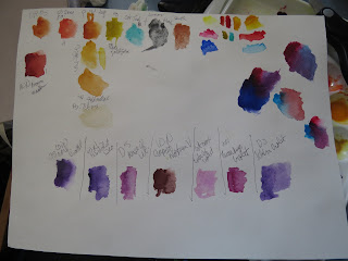
There were still six empty spaces so I started thinking about the colors that would be convenient. I loved the old alizarin crimson but it proved to be fugitive but I think that Winsor & Newton's Brown Madder is a good substitute. I forget to use it in it went. I tested all of my purples (yes, I have a few) and then mixed the reds and blues I already had added to the palette and discovered that mixing one would be better. 
My testing sheet - inexpensive paper that has few other uses but is excellent for this. 

I wanted Daniel Smith's Transparent Permanent Orange because it is proving to be a great paint as has my old favorite DS Quinacridone Gold. Rich Green Gold is appealing as is Cobalt Teal, both Daniel Smith's. 

The mostly filled kit with a cheap brush for splattering.
I still have one space left. I set an empty-half pan in front of the palette for comparison. Half pans  are deeper but the eye-shadow slots would allow a bigger brush to make less of a mess.

I love to have some sparkle and often have some gold available but I also love to have some Lunar Black (Dan Smith) which can give some wonderful texture to other colors, too. For now, it is empty. I haven't decided if or which brush I will be trimming down to add in there. Because the lid is domed, it will hold thick things, as long as they don't roll off into the paints. For now, it is set aside for the paint to dry. There is nothing worse than having a palette of freshly added paints turn upside down in the bottom of a bag and you don't notice it before it has all mixed and dried after running all over everything.

I just scuffed up the inside of the lid with a fine, sponge sanding block to make the paint not bead up. It is foggy but works well. I also positively know that a waterbrush will not fit inside... It will have to be put in my kit.